Review of a Reviewer, By Johnathan
/Specifically myself. I had planned a review based on the cover of last weeks Countdown, seen here:
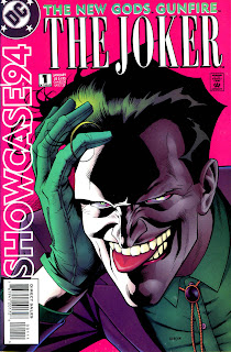
 Which had reminded me a lot of Showcase '94 #1, shown here:
 It was going to be about how I thought maybe the artist of the former had cribbed off of the latter, but once I looked at it: no dice. I do prefer the Showcase '94 Joker though, in that he has actual human facial features that have been composed into what I like to call an 'expression' rather than having a deformed perma-grin. I'm never impressed when an artist on a joker-containing comic goes the route of simply carving his face into a maniacal shape and leaving it at that - it robs him of some of his charm/versatility.
But this is about me. For not actually looking at both covers together before planning my review:
NOT APPROVED


